skull

Free vector skull distributed by Tshirt Factory.
Free vector skull distributed by Tshirt Factory.

Second pack of detailed silhouette of female bodies from fashion shows. Enjoy John

These are feather vectors that I redraw from an old design book.

Colorful fun dingbats in vector format (.ai, .eps and .svg). These vector graphics can be easily ...

Sample file from hand drawn heraldic series vector pack by www.stockgraphicdesigns.com. Included ...

Lovely background design with hand drawn natural shapes. Use for summer/spring projects. Check ou...
   
|
By Sean Geng
Nowadays everyone’s using a different browser. Between popular options like Firefox, Safari, Chrome and Internet Explorer, which make up close to 98% of the internet market share of browsers, and the other little known browsers like Konqueror, there are a multitude of browsers being used to view your site.
How does your website function across all these options? It’s important that your website is usable across all major media, whether it be popular browsers, mobile devices, or any other web browsing devices. In this article, we’ll cover some basics of making sure your site is cross-browser-compatible, including snippets and resources to help you along the way.
Not everyone uses the same browser. Similar to how everyone is running on a different operating system, you can’t expect all people to be using the same web browsing tool.
So what are the options? The data about current browser share varies depending on the source and the region, but in general, Internet Explorer, Firefox, Chrome, Safari, and Opera make up most of the market share, with Internet Explorer dominating the market. Internet Explorer 8 has over 25% market share, Internet Explorer 6 has 215 and Internet Explorer 7 having 14%.
When there are so many different options out there, each running their own rendering engine, how do you ensure that your web design or application will hold up in each of them? That what we hope to cover and provide solutions for in this article.
So, how does your current site perform in the multitude of browsers that are out there? Why not check for yourself? If you don’t want to install all the major browsers out there on your own personal machine, here are some resources to help you out.
Adobe Browser Lab
Adobe Browserlab offers an awesome solution for viewing on demand screenshots of your site. This is usually my go-to program for testing in various browsers.

Browsershots
Makes screenshots of your web design in a lot of different browsers. After you submit your URL, it gives you a url where your screenshots will be loaded up.

Browser Sandbox
Runs an application to view your site in a variety of browsers.

Browsrcamp
Allows you to test the compatibility of your design with Mac OS X browsers.

IE Tester
A free WebBrowser that allows you to check how your site looks like on IE8, IE7 IE 6 and IE5.5 on Windows 7, Vista and XP.

So turns out your site doesn’t function as expected across all the major browsers? Don’t worry. It happens to the best of us. Now it’s time to go about fixing it.
First off, validate your site. Ironing out those XHTML and CSS errors can often solve those pesky browser bugs. I suggest running your site through W3’s XHTML Validator and CSS Validator.
Another great way to ensure your site is cross browser compatible is to always reset your CSS before working on a project. There are many different global CSS resets, but Eric Meyer’s one and Yahoo’s one are considered to be the most correct ones:
html, body, div, span, applet, object, iframe,
h1, h2, h3, h4, h5, h6, p, blockquote, pre,
a, abbr, acronym, address, big, cite, code,
del, dfn, em, font, img, ins, kbd, q, s, samp,
small, strike, strong, sub, sup, tt, var,
dl, dt, dd, ol, ul, li,
fieldset, form, label, legend,
table, caption, tbody, tfoot, thead, tr, th, td {
        margin: 0;
        padding: 0;
        border: 0;
        outline: 0;
        font-weight: inherit;
        font-style: inherit;
        font-size: 100%;
        font-family: inherit;
        vertical-align: baseline;
}
/* remember to define focus styles! */
:focus {
        outline: 0;
}
body {
        line-height: 1;
        color: black;
        background: white;
}
ol, ul {
        list-style: none;
}
/* tables still need 'cellspacing="0"' in the markup */
table {
        border-collapse: separate;
        border-spacing: 0;
}
caption, th, td {
        text-align: left;
        font-weight: normal;
}
blockquote:before, blockquote:after,
q:before, q:after {
        content: "";
}
blockquote, q {
        quotes: "" "";
}
body,div,dl,dt,dd,ul,ol,li,h1,h2,h3,h4,h5,h6,pre,form,fieldset,input,textarea,p,blockquote,th,td {
        margin:0;
        padding:0;
}
table {
        border-collapse:collapse;
        border-spacing:0;
}
fieldset,img {
        border:0;
}
address,caption,cite,code,dfn,em,strong,th,var {
        font-style:normal;
        font-weight:normal;
}
ol,ul {
        list-style:none;
}
caption,th {
        text-align:left;
}
h1,h2,h3,h4,h5,h6 {
        font-size:100%;
        font-weight:normal;
}
q:before,q:after {
        content:'';
}
abbr,acronym { border:0;}
Either include thet CSS reset styling at the top of your stylesheet, or have Yahoo host it and simply link to it in your HTML-documents, right before your own stylesheet:
<link rel="stylesheet" type="text/css" href="http://yui.yahooapis.com/2.8.0r4/build/reset/reset-min.css">
Another popular method of ensuring your site is cross-browser-compatible is targeting specific browsers using conditional statements. Basically, the idea is to detect the user’s browser, and if it is one of those specified, it should perform a certain action.
One of the most common uses of conditional statements is to include a stylesheet if the browser is Internet Explorer. By doing this, you can correct some bugs that exist in your code and override your current stylesheet.
To use conditional statements, simply include the statement in the head section of your XHTML, right below the stylesheet inclusion.
Include a stylesheet if the browser is IE
<!--[if IE]>
        <link href="ie.css" rel="stylesheet" type="text/css" />
<![endif]-->
Target Specfic Versions of IE
<!--[if IE6]>
        <link href="ie.css" rel="stylesheet" type="text/css" />
<![endif]-->
(Of course, you can replace IE6 with any version of IE)
If you are looking for a more specific way of targeting browsers and even operating systems, then you should consider checking out Techpattern’s PHP Browser Detection Script. It’s a very powerful script that will detect everything from your visitor’s operating system, browser, JavaScript support, screen resolution, and more.

For a jQuery-based solution of detecting browsers and adding a corresponding class to the body of your site, check out TVI Design’s Browser Detection using jQuery. The script adds a class to the body, which you can then style in CSS.
Things are changing. New devices are emerging as a medium for browsing the web these days. Whether it’d be smartphones, iPods or an iPad, there is a new enviornment for web design and as they become increasingly popular, it means that you must also take them into consideration when designing a site.
How about testing your site in some web based mobile emulators? If you are looking to test your design in a mobile device, here are some great resources:
Test iPhone
Simulator for quickly testing your iPhone web applications

iPhoney
iPhoney is a free application you can download in order to simulate a iPhone browsing experience. Includes support for rotating, zooming, and even turning off plugins like Flash.

MobiReady
Excellent tool for testing in mobile devices. Provides feedback including test results, options, and emulators.

Mobile Device Emulator
A great way to test your site across a multitude of mobile devices.

So how do you go about making your site mobile friendly? Well, if you are interested in pursuing a mobile version of your site, here are a few ways of doing so.
Redirect Users on a Mobile Device
An easy way of making sure your site is mobile-friendly is to redirect users viewing it from a mobile device to a certain “plain” version of the page on your server. Some of the easiest ways of doing this include Studio Hyperset’s Mobile Redirect Script, or using Mobiforge’s Lightweight Device Detection in PHP.
Mobify
Mobify allows you to design a mobile version of your site based on your current design. It also allows for traffic stats and advertising options.

Mofuse
Mofuse lets you create a mobile version of your blog for free. It’s pretty easy, and only takes a bit of time.

Still hungry for cross browser compatibility resources and solutions?
Sean Geng is a freelance web designer based in Pittsburgh, PA. He is the site curator over at Designmess, a online community for designers and developers. You can follow him on Twitter, or contact him via his website.


Quick tips are 3-5 minute screencasts, short articles, or short 6-10 step tutorials on how to do something simple, quick, but useful. There are lots of tips, tricks and techniques that can be packaged into brief educational material. Read on if you have some ideas for submitting a Quick Tip to Psdtuts+, we’d love to hear from you.
We post numerous quick tips each week, and pay $50 USD as the base rate for these. Following is information on creating these. You can learn more on our updated page: Submit Tutorials, Tips, Articles, or Other Content.
See our Written Tutorials section for information on putting together a written tutorial. Quick Tip tutorials are similar, except these are shorter and more focused (6-10 steps). Here is an example:
See our Video (Screencast) Tutorials section for information on putting together a video/screencast tutorial. Quick Tip screencasts are similar, except these are shorter and more focused (3-5 minutes). Here is an example:
See our Articles section for information on putting together written articles. Quick Tip articles are similar, except these are shorter and more focused (around 500 words). Here is an example:
You can send in for review a single JPG image, and a short paragraph quick tip pitch, prior to writing or recording your quick tip. You can do this by following this link:
Once you’ve finalized your work, completed quick tips can be submitted here:
In cases where the final file is larger than 15mb you can contact the editor through the Psdtuts+ Preview Submission Form and discuss sending the file via a service like yousendit.com.
There is quite a bit of diversity of content we publish on Psdtuts+, and we’re expanding all the time. Learn more about writing tutorials, putting together articles, or recording screencasts, in addition to making Quick Tips on our updated page: Submit Tutorials, Tips, Articles, or Other Content.


In today’s screencast we will revisit a tutorial by Anastacia Sholik that demonstrates how to illustrate a fun red-haired child in Adobe Photoshop. This tutorial shows how to use shapes, layer styles, brushes, and other tools and effects to add dimension of depth to our character.
View the written version of this tutorial How to Create a Fun, Red-Haired Boy Character


Science fiction art is seen everywhere these days. If you enjoy a good blockbuster movie or spending your Sunday afternoons playing Halo or Final Fantasy, you probably know sci-fi concept art quite well. Sites such as Behance or DeviantART frequently post incredible sci-fi concept art renderings. This post showcases a collection of 40 incredible and stunning sci-fi concept art pieces to help boost your creativity; most of which have been created using Adobe Photoshop or a similar application with the artists bare hands. Enjoy!

This stunning matte painting by Bechira Sorin uses some lovely colors, including various washed-out shades, to give the piece a surreal and soft look.

This great painting by Sven Sauer is a concept piece for a television sci-fi series. The painting reflects the atmosphere, mood and the intensity of destruction.

Another piece by the great matte painter Sven Sauer. This piece was specifically painted for a background image for the “Perry-Rhodan” adventure game.

The dark and gloomy atmosphere in this painting by Wayne Haag makes the main source of light from the spaceship stand out like there’s no tomorrow.

This book cover design by Franco Brambilla uses a cleaner and brighter color scheme compared to most others in this showcase, making it very unique.

An absolutely incredible piece of digital art by David Fuhrer. The intensity of glowing lights makes this work fascinating to look at, and is very inspiring.

This piece by Husam Elfaki was produced differently than many others in this compilation. Instead of a painting, it is actually a photo manipulation, and a pretty impressive one!

This shuttle concept painting by Benjamin Penrose revolved around the narrative of “seeding” a new planet with life. The mothership design was based upon a seed pod containing hundreds of shuttles.

A wonderful sci-fi space illustration by Walter Vermeij, using a lovely selection of colors to produce a dramatic atmosphere.

This piece by Daniel Conway uses a dull and limited color scheme to make the red tie (the title of the piece) stand out. The background was completed in a short period of time, allowing the user to focus more of their attention on the subject rather than its surroundings.

Hostile Takeover is a digital painting by the talented Marek. This particular piece of art was for a book cover for Polish publisher “Fabryka Slow”.

Another piece by Marek. This digital painting was used as a cover for the awesome comic book “Shrapnel: Aristeia Rising” (Issue #3), published by Radical Comics.

This digital painting by Ukitakumuki was completed as a ‘pre-concept’ piece for Shrapnel (Zombie Studios).

A very impressive monochrome digital painting by Vitaly Alexius, completely specifically for the “Inherited Hell” CD cover for a music band named Stonecast.

Another piece by Ukitakumuki, this time completed for the San Diego Comic Con’s souvenir book. The piece was inspired by Heinlein’s concept of cap(sule) troopers.

This great piece of art by Vitaly Alexius was created in Photoshop at a whopping 10,000 x 7,617 pixels at 300dpi. The illustration (and story that goes with it) was witnessed in a dream; several weeks were spent on this project.

This piece by Torvenius has a slightly rougher look to it than most others in this post, and took just 55 minutes to complete.

A steampunk piece by Patrick Reilly, using a strong combination of copper tones to really bring out the great highlights and shadows in the piece.

A wonderful sci-fi piece by Raybender, created for a Steampunk Challenge over at CGTalk.

This experimental exploration project by Vitaly Alexius was created for the improvement of anatomy, perspective, colors and expanding the artists “dreaminism” style and ideas. This piece was completed in Photoshop and took approximately 2 full days (40 hours) to complete.

This gloomy, dark and grim Warhammer piece by Rado Javor incorporates the differences between light and shadow very well, making it pleasing to look at.

A slightly different approach to digital painting and airbrushing by Antifan Real, using vivid colors and dynamic lighting to give the piece a new form of life. This illustration was completed for the digital painting book “Bold Visions”.

An incredible piece completed by Lorenz Hideyoshi Ruwwe for a sci-fi/horror saga called “The Lost Launders” written by Matthew Ewald.

Hide and Seek is yet another piece completed by the great digital painter Marek. This piece was created for the workshop section of popular magazine “ImagineFX”, and was produced by hand in Photoshop.

Another piece completed by Marek for the great “ImagineFX” magazine. This particular piece combines various different styles, making it different and unique compared to a lot of others showed in this post.

This wonderful piece “Heaven 2.0″ by Nicolas Ferrand was completed as a challenge. The gorgeous color scheme and highly textured canvas adds a lot of depth to the work.

“Future City” by Antifan Real uses a lovely warm, glowing color scheme. Based on a crop from another piece, this piece took just 70-80 minutes to complete, incredible keeping in mind the amount of detail this piece has!

A personal piece of work by Lisa Rye, featuring a spiral staircase that was originally a three dimensional model, and then brought to life using Photoshop and a Wacom Intuos graphics tablet.

The popular Marek is back again, this time with an apocalyptic-style traumatic painting. Originally this piece was going to be a promotional piece but ended up being a personal piece of work.

The monochromatic (almost black and white) style of this painting by Vitaly Alexius adds a superb dimension and makes the viewers appreciate just how incredible the lighting and shadowing skills used in this painting are.

This lovely space scene by Antifan Real consisted of 20-22 hours work, and was completed purely in Photoshop CS3 using a Wacom Intuous 3 graphics tablet.

By Antifan Real once again, this green monochromatic-style painting puts the power of depth to great use to create this interesting composition. The piece took 15 hours from start to finish.

As you can tell from this compilation, Vitaly Alexius is a very busy digital artist. This piece took over 50 hours to complete and it’s clear to see why. Click through to see some of this piece whilst in progress, as well as early sketches.

Into The Fray by Ukitakumuki is a very detailed experimental piece of digital art, combining modern warfare with zombies and a touch of sci-fi.

This personal piece by Yap Kun Rong started (unbelievably) as a speed painting on a Nintendo DS. The artists imagination took over, and it was eventually taken into Photoshop to create this stunning and vivid piece.

Finished off nicely with some white symbols, this huge A1 poster painting by Ukitakumuki was completed as a solo project for a diploma/college class.

Compared to most others in this showcase, this piece by Cyril Rolando may look quick, but in fact it took over 40 hours from start to finish. Its warm color scheme and soft tone make it a pleasure to view.

This industrial-style painting by Amir Salehi holds such detail that, without very close inspection, it appears to be real life. It was painted in Photoshop CS3.

Kai Spannuth has combined two eye-peeling colors from the opposite ends of the spectrum to create a wonderful first-person style painting completed in Photoshop CS2.

The glowing yellow and orange color palette combined with the fine detail of line-work in this piece by Theo Prins is spectacular to look at. Before it became Waterfall City Extreme, it was just Waterfall City. Click through to see the original piece, which wasn’t sci-fi.


Matte paintings are images commonly used in the film industry to create the illusion of an environment that would otherwise be too expensive or impossible to build. In this tutorial I will show you how to turn a single stock photo into a realistic panoramic scene. Click to enlarge the image.
The following images were used during the production of this image.
Download the following stock image in order to follow this step-by-step tutorial: if you choose to work on a different plate, try to find a photo with a mostly clear sky so it will be easier to enlarge the photo in the following steps.
Now open your stock of choice in Photoshop and increase the canvas size in all directions except for the ground. First right-click on the background layer in the layer palette and choose the option Layer From Background. Name your layer plate. After that go to Image > Canvas Size and set Width to 3250 and Height to 1450 pixels. Make sure to select the bottom centre rectangle for your canvas extension area in the Canvas Size menu and click OK. The image should now be extended with a transparent background.

Now we will start to fill the new transparent area with life. This might turn out to be a very time consuming step if you are not used to working with stock images in this way. Duplicate your plate layer and move the original layer with the Move Tool (V) about 200 pixels to the left where the background is to be enlarged. Make sure the Show Transform Controls in the upper menu is selected and then increase the size of the layer to about 101%. Why do we do this? Have you noticed the thin white line in our stock image? The new area has to blend seamlessly with our original image, therefore we have to move both lines to the same height.
Next we have to get rid of the sharp edges in the upper layer. For this, select your duplicated plate layer in the layer palette and add a Layer Mask by clicking on the Add Layer Mask button below. Select the Brush Tool (B) and pick a large 200 pixel round soft brush to delete unwanted areas of your layer. To do this you will have to set your Foreground Color to black and Opacity as well as Flow to 100%. Then start brushing on your edges while the layer mask is still selected.

The left area now obviously looks duplicated, so we will use the Clone Stamp Tool (S) to fix that. First create a new layer on top of all other layers, then grab the Stamp Tool and select the option Sample: All Layers in the upper menu. This way the Stamp Tool will clone areas from all layers, while it will neglect everything except for the selected layer in case the option Current Layer is chosen. Again use a large round soft brush and set its opacity to about 50%. This is a very experimental step, so I recommend that you vary your brush sizes and opacities to get the optimal cloning result. Make sure you press Alt on your keyboard while you select the desired area in your image that you would like to clone. Do so with a single left-click.
After selecting your area, stop pressing Alt and click in your empty layer once again to start cloning. Depending on the direction you are moving with your mouse the Clone Stamp Tool will now recreate elements from the desired area in your new layer. Make sure you do not cross noticeable edges of your image while cloning as it will bring the quality of your result down a lot. With some patience you might get a similar result to mine. Feel free to merge your background layers whenever you are satisfied with the result. Be aware that it is not as simple to correct mistakes afterwards.

Use the Clone Stamp Tool as described in step three in order to expand the background on the right as well. This is, again, very experimental. Try to clone some nice cloud formations and blend them as best as you can with your original plate layer by using methods from steps two and three. There is no need to be overly accurate here, as we will cover the sides with photos of trees and bushes later on.

Create a new layer and then go to Image > Apply Image with the settings shown in the following image and press OK. We will now fill the empty areas by increasing the size of this layer. Go to Edit > Free Transform and increase the layer size to about 130% until all empty space is filled. The sky in our background is very dusty and grainy so this method does not hurt the quality that much. I usually do not recommend using this technique as it may bring down the quality of an image drastically. In our case the relevant areas will be hidden by other elements at the end, so it does not really matter to us.
Next, add a Layer Mask and erase all the parts in the center where the applied image and original layers overlap each other. That way we will keep the quality and sharpness in the central areas high. Like in step two, try to blend your layer as best as you can. You might want to use the Clone Stamp Tool again in order to fix all bad transitions, which you do not plan to cover with other elements in the end.

In this step we will fill the canvas with more chimneys. Again go to Image > Apply Image as explained in step five. After that select Edit > Free Transform and rotate your layer 60 degrees clockwise. Then erase the chimneys but keep the smoke. We will add new chimneys instead to add variety to our scene. I have used the following stock photo: chimney.
Drag this layer into your file and erase everything except for the chimney. You can use Adjustment Layers to blend the stock photo with our original plate. Create a new Adjustment Layer by clicking the fourth button at the bottom of your layer palette and choose Hue/Saturation from the menu. Our other chimneys have a dark purple color, so adjust the colors as followed: Hue = -108; Saturation = -43; Lightness = -14.
Right click on your new Adjustment Layer in the palette and choose Create Clipping Mask. Make sure your Hue/Saturation layer is right upon your chimney as a Clipping Mask only affects one single layer and not the entire image. Repeat this step if you need to add more chimneys. You may want to set the Blending Mode of your chimney layer to Darken in order to blend it nicely with the background (do not forget to extract it with a layer mask or whatever technique suits you best). I also reduced the opacity to about 40%. It is reasonable that objects in the distance are covered with a lot of dust and haze, which is why we have to decrease the contrast to create the illusion of depth.

Use the Clone Stamp Tool (S) described in step three to compliment the smoke on the right with additional clouds. However, pay attention to lighting and shading of the smoke while cloning areas. Concerning other objects in our image, the smoke clouds should always be lit from the right. In order to blend elements properly you always have to keep track of your color of light and shadows, as those are essential for a coherent image and realistic atmosphere.

Apparently there is enough empty space for another chimney. Download the following stock image which appears to have similar lighting conditions: chimney2. The photo is desaturated, so we will have to recolor it. Open the stock photo and go to Image > Adjustments > Color Balance and Image > Adjustments > Brightness/Contrast to adjust the image with the following settings. Start with Color Balance and then do brightness adjustments. Do not change this order as it will alter your results greatly! After that drag the photo into your work-file and erase all unneeded areas. I recommend extracting it with a large round soft brush at different opacity levels.

The new chimney does not blend very well with the scene yet, so we will apply a couple of additional adjustments. Firstly, create a new layer on top of your new chimney and set the Blending Mode to Soft Light. Pick a small soft round brush (about 20 pixels) and turn the Opacity of your brush down to 30%. Set the Foreground Color to white and then brush over the right of the chimney to brighten it according to the direction of our light source. Secondly, create a new layer, set the Blending Mode to Multiply and now brush over the chimney in order to darken it. This time be careful with your brush opacity as the Multiply Blending Mode tends to work more effectively than the Soft Light mode. Set the opacity to about 10% and change the Foreground Color to black or dark grey. Thirdly, create another new layer, again set its mode to Multiply, but this time grab a larger soft brush (about 100 pixel) and set the Foreground Color to #f0b5aa. By brushing over the smoke we will mainly adjust the colors of its highlights and therefore change the reflection of light. Depending on your result you might want to experiment with the layer opacity as well. Try to get a similar result to mine by varying brush sizes and opacities.

Our image still looks awkward, but we will now finally add the missing foreground elements! Feel free to look for tree and bush images yourself. You may also download the following: 1, 2.
First open stock image #2 and drag it into your work-file. The layer should be on top of everything else. Due to the fact it has a white background it can be extracted fairly easily. Go to Select > Color Range and make sure Sampled Colors are selected in the drop-down menu. Then click left into the white area of your layer to get the right color with the Eyedropper Tool. Set the Fuzziness to 95, activate Invert and click OK. After that directly apply a mask to this layer by clicking the third button at the bottom of the layer palette. If you did everything correctly, the branch should now be almost entirely extracted. You will most likely see some awkward white lines around it. Don’t worry about them for now because first we will apply a few color and lighting adjustments.

The most important aspect of a matte painting is that all elements in our composition have similar lighting conditions. The easiest method to blend your stocks properly is to check highlights and shadows of your original plate and adjust the new elements accordingly. In our image the foreground elements (the bushes) are very dark, so we must decrease the contrast of our branch a lot to ensure that it blends nicely with the scene. Click on the fourth button in your layer palette and add the following Adjustment Layers (see image below). Once again make sure you don’t change the order. After that turn every Adjustment Layer into a clipping mask applied to your branch as described precisely in step six. Lastly set the Opacity of your branch layer to 85% and change the blending mode to Darken. Hopefully all white edges are gone now.
Finish this step by mirroring the branch layer with Edit > Free Transform and then move it to the upper right corner until you are satisfied with the composition.

Now open the other stock image and try to change the color of the trees to a dark and desaturated purple with less contrast. I recommend to experiment with adjustment layers yourself. If you can’t get a similar result, use the following settings and drag the finished product into your work-file. Put it below the branch so that the tree layers overlap each other nicely. Set the blending mode to Darken. In this tutorial we will only use the right half of that stock image, however, feel free to make use of the left half as well.

This needs more work on blending: Select the tree layer and then erase the red marked areas with a big round soft brush and brighten the green marked parts with the Dodge Tool. Make sure the Dodge Tool is set to Midtones with low Opacity (something around 15% will do it). Dodge the upper tree leaves until they disappear behind the branch we added in step 10. Do not overuse the Dodge Tool, though, as it also desaturates your stock image in the process. If the leaves appear to be too desaturated afterwards you might want to adjust them with Image > Hue/Saturation again.

There is still a small area to the left which needs to be fixed. Create a new layer upon your tree layer and set the Blending Mode to Color. Now pick a purple color from the background with the Color Picker Tool (I chose #a08999) and brush onto the yellow marked area. After that turn the layer into a Clipping Mask and set the layer Opacity to 75%.

As you might know cutting stock images of trees can be really exhausting. I have a special technique that is very useful for extracting images with leaves or any other random and sharp pattern. Download the following stock image and adjust the colors and contrast as described prior: stock. Drag this image into your canvas and position it as you like. Now add a Layer Mask as explained in step two and grab the Brush Tool (B). Photoshop comes along with a lot of nice default brushes. We pick the leaf brush: Scattered Maple Leaves and set the size to 44 pixels. Check the attached images if you are unsure of what brush I am talking about. Also the settings for Scattering and Shape Dynamics are really important. Choose black as your Foreground Color and then draw into your Layer Mask to extract the leaves. You will notice that this technique is not very accurate, so you might want to vary with scattering, brush size and opacities in order to get a better result. This method works best for objects with a random pattern, and a graphic tablet can be of great use, too. In case the contrast of this layer comes off as too high, set the Opacity of this layer to about 80%.

Keep adding more trees and bushes in the foreground with the techniques listed in steps 10 to 15. Most importantly try to cover all the flawed areas which are still left. Also keep in mind that the basic composition tends to be central/symmetric, so try to fill equally as much space on the left as we did on the right to keep our composition in balance. Do not just simply copy + paste the existing layers. Matte Paintings have to be as realistic and convincing as possible, so any repetition in our scene will hurt the atmosphere of our piece badly.

Now we need to fix some lines that disappear in our painting. This is very easy to do if you own a graphic tablet, if not use the Pen Tool (P) to create perfect lines. First create a new layer, then switch to the Pen Tool and click once for the starting point and a second time where you would like to end the line. Click and hold your mouse and then move it around to create perfectly curved lines. Before you go on, pick the Brush Tool and set the brush to Hard Round 3 pixels. After that choose your Foreground Color with the Color Picker Tool and pick up the color of the already existing lines, which should be #857082. Now switch to your Pen Tool again – make sure the paths are not gone yet – click right on your image and select the option Stroke Path. Select Brush from the drop-down menu and click OK. Finally deselect the path and repeat this step for all other missing lines.

Since the basics of your image are done, all the following steps are optional. Feel free to proceed to step 20 where final touch-ups are made. In this step we keep adding more details to our composition to create more levels of depth and some interesting eye catchers. Let us start with adding more factories in the background. Download the stock image and make use of the fact that it has a dark silhouette on a bright background. In this case the Blending Mode Darken works very well. Try to brighten the sky of your stock image until it is brighter than the background of our work-file, but at the same time keep the silhouette dark, so that it will not disappear when we switch the Blending Mode.
Additionally, do not forget to change the color to purple with Image > Adjustments > Hue/Saturation. Use the attached settings if you are unsure. You may place the factories several times in your background, always using different elements of your stock image in order to keep variety. Keep in mind that your composition has a lot of distance haze, so the new factories should be similar in contrast to the already existing chimneys. It can be helpful to reduce the layer Opacity to a value of 60%.

Add some animals to your composition and bring your picture to life in order to make the scene more convincing. Also think of any other details that may support your concept. Our image represents the typical conflict of nature and technology, so a good idea could be to search for images which present deforestation, for instance rotten trees or tree stubs. Some of these stocks can give you an idea of what I am talking about: 1, 2, 3, 4. Always pay attention to your light source while adding new elements. Use Adjustment Layers and Blending Modes to blend your images according to your light source.
I will give you one more example: Extract the tree stub and place it in your image where you like it best. Don’t forget to change the color to purple. Now create a new layer on top of your tree stub and turn it into a Clipping Mask. With the Color Picker Tool selected pick up a color from the highlights of the smoke in the background and then brush on your new Clipping Mask with this color to add highlights to your tree stub. Switch the Blending Mode of your Clipping Mask to Overlay.
Apply this technique on all other objects you would like to add. Experiment with the Blending Modes as the result always varies depending on the photo which you are planning to use. I can recommend the Blending Modes Soft Light, Overlay, Screen and Color Dodge for all actions which imply adding highlights to your composition.

This is almost the final step. In this step we are going to add a lot of color and contrast Adjustment Layers, which will completely change the atmosphere of our image. The final result will look much more like an actual artwork rather than a photo-manipulated stock image. First we start off with a Curves Adjustment Layer in order to improve the contrast. Create new Adjustment Layers on top of all other layers with the following settings.

You can stop here if you like this surreal night scene. Otherwise add some more Adjustment Layers as we are going to turn night into day with this step.

There is a small area to the left which pops out with blue color. Fix this area by creating a new layer and setting the Blending Mode to Color. Pick up a desaturated brown color (#6b6254) and then brush over those parts which have to be recolored. After that decrease the layer Opacity to 75%.
Furthermore, we are going to add some light rays. Create a new layer, select the Paint Bucket Tool (G) and fill it with black. Then grab a big round soft brush and pick a bright orange color. You can now draw diagonal orange lines onto your black layer (in case you own a graphic tablet), or click once with your mouse into your black canvas and create a big round circle. Then go to Filter > Blur > Motion Blur. Set Angle to 45° and Distance to 999, then press OK. After that set the Blending Mode to Linear Dodge, which will result in some nice lighting effects. Move your layer around and erase the parts which you do not like. You may also duplicate and distort this layer if you want to add even more light rays. That is all up to you.

When you are finished, your image should look something like the image below. Click the image to enlarge.


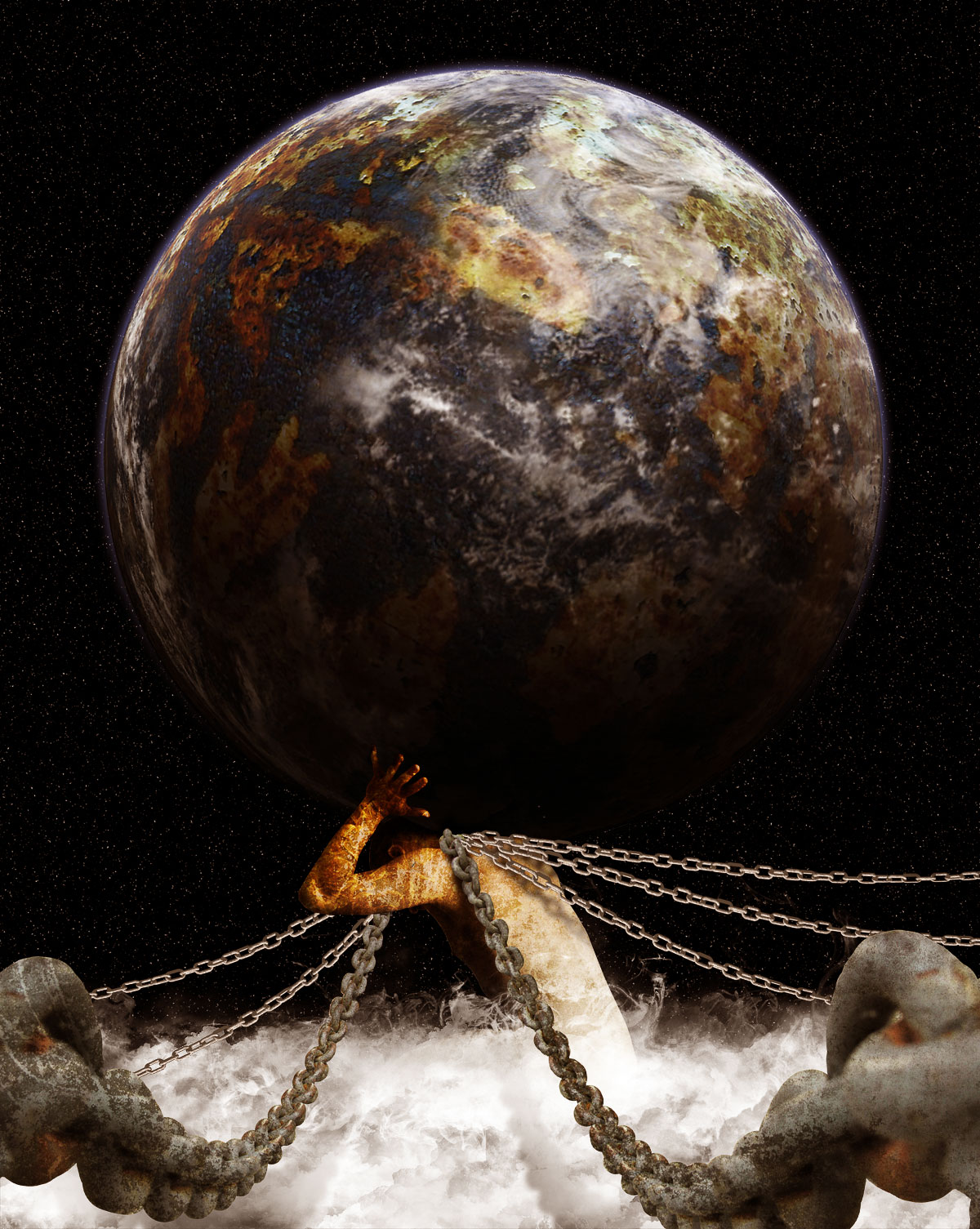
In Greek Mythology, the Titan Atlas literally carried the weight of the world on his shoulders. This is because when the Titans were defeated Zeus condemned him to hold the Earth in place. In today’s tutorial we will demonstrate how to depict Atlas’ punishment using stock photography and Photoshop.
Today, we will be using the following stock photos.
Open stock for atlas model, using Pen tool, extract model from its background and then duplicate it on a new layer. Change layer’s name to atlas.

Fill background layer with black. We need a bigger canvas; go to Image > Canvas Size menu. For easier resize process, choose percent and then fill in Width: 120, Height: 140 percent and Pick middle down anchor point. This way, canvas will be resized upward. Click OK to confirm resize.

Open earth stock, notice that the earth consists of three layers, delete background layer so now you only have two layers left. Go to Layer > Merge Visible or just press Cmd+Shift+E to merge visible layers.

When done, insert the Earth in to atlas illustration. Make sure you place the Earth’s layer below the atlas layer, then rename its layer to ‘earth’. Resize earth to make it larger, then rotate it to the right so the dark side of earth is in the left side. Press Enter to confirm transformation.

Click back to atlas layer then resize (Cmd+T) to make it smaller. Make sure atlas image is resized proportionally by holding Shift when you drag the corner control point. Hit Enter when done.

Use Crop Tool to crop canvas size. To give celestial atmosphere, add stars to the background. For that purpose, select background layer then click Filter > Noise > Add Noise. Adjust Amount value around 100%, select Gaussian and check Monochromatic ON.

Click OK, then background layer will be filled with noise. Blur it using Filter > Blur > Blur More. You can repeat this step by pressing Cmd+F in case you want the noise look even more blurry. Press Cmd+L to bring up Levels dialog. Adjust input levels by dragging its slider’s until the number of "stars" is reduced, or until you have found the desired result. Click OK to confirm levels adjustment.

Activate Brush tool, then load the cloud brush (you can find and download the cloud brush here). See image below to learn how to load brushes.

We also need more space to draw the clouds, so resize atlas and earth to make its smaller.

Select white as your brush color and make sure Brush Opacity is 100%. Create a new layer on top of your atlas layer, then start creating clouds using various cloud brushes. As you can see, the clouds are placed below the atlas body. To get better results, try to vary multiple cloud brushes as shown below.

Now load some ink brushes in to Photoshop (you can find and download ink brush here). Same as before, combine multiple ink brush to get varied results.

Add a layer mask to cloud layer. Now paint layer mask with black using cloud and fire Brush with low opacity (around 20-25% ). There is no guide to do this; just try to balance the look of the clouds, not too thick or thin.

Select atlas layer, then press Cmd+U to bring up Hue/Saturation dialog. Drag Saturation slider to left to change pale skin color, and then drag Hue slider to right to change skin color look more yellowish.

Open up texture stock, use Rectangular Marquee tool to create selection. Copy selected texture in to atlas illustration.

Place texture between clouds and atlas layer’s. Change its layer name to texture and then press Alt+Cmd+G to make it a Clipping mask. This way the texture will only appear inside of atlas’ body. Change texture layer Blending Mode to Overlay, then press Cmd+T and make it smaller.

Open fire stock, create selection using Rectangular Marquee tool. Drag selected fire in to illustration.

Place it between texture and clouds layer, then change its layer to a clipping mask by pressing Alt+Cmd+G. Also change the blending mode to Overlay. This should give the texture below it a nice hue.

Add layer mask to the fire layer, then use a Linear Gradient to mask it. This way only half of the fire will be visible.

Open chain stock. You can use the Pen tool to create a selection path or you can also use quick mask selection using the Brush tool to extract the chain from its background.

After you are done extracting the chains, copy the selected chains in to the atlas illustration. Make sure that you place it on the very top of layer and name it ‘big chains’. Using free transform command, resize and rearrange the chains to the right of illustration, see image below for more details.

Duplicate chain layer, then flip it horizontally (Edit > Transform > Flip Horizontal). Drag the flipped chain to left, see image for more details.

Open and select texture stock once again, then drag it in to atlas illustration. Place this texture over the first big chain layer.

Make this texture only appear inside chain image by change its mode to clipping mask (Alt+Cmd+G). To blend texture with chains, change the Blending Mode to Overlay.

Repeat this process to the other big chains layer.

Open the second chain stock, select chain on the left by using Rectangular Marquee tool and then drag this selected chain in to the atlas illustration. Make sure you place this second chain stock on top of every layer, rename its layer to "small chain."

Use the magic wand to select and remove the black background from the chain. See image below for more details.

Rotate this small chain until it appears horizontally. Then use the Clone Stamp tool to extend the length of the chains.

Press Cmd+J four times, so now you got four new small chain layers, plus one (the original chain layer). Arrange these five chain images like the image below, as you can see, it look like the chain is attached to atlas neck’s.

As you can see, the small chains are covering the big ones. We will fix this later. Select one of the small chain, then go to Edit> Transform> Warp. Drag warp control point to make the chain curve down like the image below. Do this step in each small chain layer until all the small chains are curved.

Use a hard round eraser tool to remove the small chains as shown below.

Now we need to create shadows for the chains to add depth to the illustration. First, we need to select all the chains. Hold Cmd+Shift, then click each related thumbnail layer, see image below for more details.

Create a new layer below the cloud layer, then fill the selection with black. Press Cmd+D to deselect. Now name this layer shadow. Now rotate this chain’s shadow to the left, so you can see it, it’s also because the light source is from top right corner, so normally the shadow will fall to the left. This also gives depth to the chains.

We need to make this shadow a little blurry, so go to Filter > Blur > Gaussian Blur. Adjust Radius value around 5 to 7 px, click OK to confirm Gaussian blur. Remember, to make it even more blurry you can easily repeat this step by pressing Cmd+F.

Still in the same layer, add a layer mask. Use a soft black round Brush with low opacity to mask the shadow, so it looks as if it is fading out. See image below for more details.

Repeat steps 29 to 32 to create shadows for the other chains.

Now select the topmost layer. Hold Alt, then click menu button, choose Merge Visible. This will merge all visible layers in to a new layer.

Now go to Filter > Other > High Pass. Adjust Radius value around 1.5 to 2 px then click OK. Change this layer’s blending mode to Overlay. This step will make this illustration look sharper.

Add a new layer adjustment, Color Balance, then adjust its value so the entire illustration becomes yellowish. See image below for more details.

Take a look at the final image below.