Best Design Venues

Best Web Design Venue

Our favorite place to work tends to be coffee shops and delicatessens.  In all of the chaos and varying conversations, we can get lost in the work at hand.   One particular place that we've come to enjoy more than most is the Atlanta Bread Company in Warrenville, Illinois.   Since this franchise is family run, the atmosphere is not only welcoming, but quite inclusive and friendly.  The kindness, the artistic fervor, and the immersion within a flowing sea of people coming and going actually makes for our most productive work environment.hidden links The families that manage and own the store are some of the first people I met when moving to Illinois.  I have a large amount of gratitude for the kindness they showed me when arriving here and when we came back to Naperville this past spring.  They have welcomed us and our clients into their establishment and given us a warm environment to conduct our business meetings and web design presentations. Artist tend to flock to the "Bread" as well.  On any given night there will be some form of artistic group that is having a meeting at their location.  There are women who stitch on one night, trading card women on another, painters discussing canvasses, and many other niche artisans who wish to meet and share their talents.  For those familiar with the area, Naperville and Warrenville aren't exactly thought of as Art Mecca's, but within the Atlanta Bread, there is an exception that is a pleasant change for the Chicago Suburbs. Lastly, the absolute chaos of a busy lunch cycle completes our A.D.D. persona and elevates our productivity.  We tend to get more accomplished in a two hour rush at a coffee shop, than in eight hours of quiet within our on office.  we're going to post a lot more on this in coming weeks.  There's just an odd correlation between our better work performance and the amount of interactions taking place at the same time.  We'll be posting more about our favorite working environments in the weeks to come, but at this moment Atlanta Bread is our favorite local coffee shop for web design and seo meetings and work.
Read more...

Designing in the “New” Naperville

While many in the City of Naperville jokingly refer to themselves as "Napervillians", the area is considered one of the finest to live and raise a family.   The area is filled with entrepreneurs and families from the population boom of the 90's. They are gifted with one of the lowest crime rates and highest public education systems in the entire country.  Because of the, and many more positive aspects of the area, Naperville has become a thriving market for capital investment and small businesses to make their marks.hidden links Along with business headquarters moving to Naperville, marketing firms have grown by leaps with the surrounding area.  For many years, there were only a handful of graphic and web designers in the area.  Web design in Naperville was a decision made on lack of options.  Even recently, independent web designers just began to make a name for themselves in the area.   Most of the web design and development for all of Illinois was being maintained out of Chicago or Oswego.  Five agencies did 95%  of all design and maintenance for the businesses who are now part of the community. It shouldn't be shocking that most businesses who have been here for some time, have websites that look alike and have no real distinguishing characteristics.  With a lack of major competition, the web designers and developers that were here, got complacent and would typically make sites that mirrored even the clients competitor. As a result, Naperville has now opened up as one of the best markets for the design and develop of website services.  Although there are still a lot of "basement hosting groups" here, it has gotten considerably better with the infusion of hard working Freelancers in the area. The hosting companies with "Auto Builders" are becoming less trusted because of their obvious attempts and successes at preying on their customers; Freelancers have made a difference here as well.  At last count, there were over 100 freelance web designers just within the city boundaries of Naperville and another 150 in Aurora.  This added amount of competition has enabled the area to introduce higher quality websites than were previously available.  The price for high quality design has also normalized from the days here a select few ran the books. The recent changes in the market have evened the playing field.  Web Design companies that had massive overhead at their clients expense are going under.  The freelancers and small businesses are surviving and becoming more trusted due to their ability to survive on their humble status.  The prices for a good site have become realistic.  Instead of a local Steel Company that paid $15,000 for a pitiful 8 page HTML site, now designers locally are charging based on work and experience. I hope that it doesn't come across as though I'm excited about the way the markets have fallen.  I understand a  lot of people, including myself,  have lived through a lot of  suffering this economy has left us with.  It is on the way to recovery, but it is coming slowly and there will be more to weather.  The economic downturn has hurt business, but maybe it can be a functional way of resetting the clock. Even in these tougher times, it's becoming a better experience to be a web designer in the city of Naperville. Naper Design in Naperville, IL
Read more...

Designing in the "New" Naperville

While many in the City of Naperville jokingly refer to themselves as "Napervillians", the area is considered one of the finest to live and raise a family.   The area is filled with entrepreneurs and families from the population boom of the 90's. They are gifted with one of the lowest crime rates and highest public education systems in the entire country.  Because of the, and many more positive aspects of the area, Naperville has become a thriving market for capital investment and small businesses to make their marks.hidden links Along with business headquarters moving to Naperville, marketing firms have grown by leaps with the surrounding area.  For many years, there were only a handful of graphic and web designers in the area.  Web design in Naperville was a decision made on lack of options.  Even recently, independent web designers just began to make a name for themselves in the area.   Most of the web design and development for all of Illinois was being maintained out of Chicago or Oswego.  Five agencies did 95%  of all design and maintenance for the businesses who are now part of the community. It shouldn't be shocking that most businesses who have been here for some time, have websites that look alike and have no real distinguishing characteristics.  With a lack of major competition, the web designers and developers that were here, got complacent and would typically make sites that mirrored even the clients competitor. As a result, Naperville has now opened up as one of the best markets for the design and develop of website services.  Although there are still a lot of "basement hosting groups" here, it has gotten considerably better with the infusion of hard working Freelancers in the area. The hosting companies with "Auto Builders" are becoming less trusted because of their obvious attempts and successes at preying on their customers; Freelancers have made a difference here as well.  At last count, there were over 100 freelance web designers just within the city boundaries of Naperville and another 150 in Aurora.  This added amount of competition has enabled the area to introduce higher quality websites than were previously available.  The price for high quality design has also normalized from the days here a select few ran the books. The recent changes in the market have evened the playing field.  Web Design companies that had massive overhead at their clients expense are going under.  The freelancers and small businesses are surviving and becoming more trusted due to their ability to survive on their humble status.  The prices for a good site have become realistic.  Instead of a local Steel Company that paid $15,000 for a pitiful 8 page HTML site, now designers locally are charging based on work and experience. I hope that it doesn't come across as though I'm excited about the way the markets have fallen.  I understand a  lot of people, including myself,  have lived through a lot of  suffering this economy has left us with.  It is on the way to recovery, but it is coming slowly and there will be more to weather.  The economic downturn has hurt business, but maybe it can be a functional way of resetting the clock. Even in these tougher times, it's becoming a better experience to be a web designer in the city of Naperville. Naper Design in Naperville, IL
Read more...

Is your site out of date?

When dealing with our clients and giving consultations, we are often asked, "how often should we update our site?"  This is not a pointless or easy question to answer.  Often there are many considerations to be made to find the correct answer for the site owner.   We consider a variety of criteria to decide what the proper choice should be for each individual site.  In this post, we're going to share the top five questions used to determine the need and frequency of site updates and revisions of web design needed to keep the site up to par. hidden links 1. What do your customers and site visitors know you for? To some this may seem like an unlikely question to start with, but it really needs to be the basis of all choices with web design.  Like a logo, letterhead, and all print media associated with a company, a site can be a major branding for the basis of client recognition.  If the website design is one recognized by the readers, it may cause a negative response to make a massive change in the way it's is read.  Likewise, if the website is the weaker link of media associated with the company, it will need to be designed in a way to compliment the company and its preexisting media.  While content will always reign supreme to the search engines, genuine viewership is still the ultimate goal of a website. 2. Is this a vanity website or one meant for inbound marketing? Ok, we've talked about this before and heard negative response for the choice term "vanity site", but it is what it is.  It's  not a negative or positive statement about a website to call it a vanity site.  If the only  purpose of your website is to have one to be followed off of a business card, then you may not be concerned with how the site looks on a regular basis.  The use of these sites, while decreasing, is still common enough to be asked when deciding web design criteria.  It may not be in the interest of the site owner to have frequent and extensive web design if the website is only to be viewed by  a select group of people.   Often major web design updates are associated with a website that is trying to build and convert newer and inbound traffic instead of regulated and specific visitors. 3.  Much like the last question, what is the site to do for you and your business? It's very difficult to design a website or revise one when there is no clear goal to be set.  Some view web design in the same way they would view making a pamphlet or Power Point slide-show. Those who have experienced a bad design have found that web development and web design are key to converting visitors into regular viewers.  If a site is meant to be informative in a serious manner, but looks like  something of a comical nature, viewers will be confused.(one more reason to stop using Comic Sans)  The website design must match the content for readers to truly appreciate it without confusion or blatant distaste.  While there are still debates of how much psychological responses to a design can be felt, there is a consensus that they do impact readership.  Bringing the design of your site in line with the theme of its content will ensure that readers are left with an accurate interpretation of the content meaning. 4.  Code, Code, Code!!!! If your website is still trudging away on legacy HTML with tables, it may be a good time to consider moving to a better framework.  Table usage in websites was never meant to progress to the levels that it did.  They were invented for simple actions, but after some time, were being manipulated to design all aspects of site layout.  With the advent of CSS, these tables are no longer needed in such long and drawn out lines of code.  Your website can move more efficiently, be designed in a better and cleaner way, and... Oh Yeah, the search engines will appreciate it. 5. HTML or PHP It would also be good after asking the previous questions to determine if the HTML in your website should be replaced with PHP. Whether using a database driven CMS like Joomla, Xoops, Drupal and Wordpress, or just wanting a basic PHP scipted website, you'll be able to more easily updated for content.  Regular updates can be helpful to sites that aim to offer newer information to viewers on a regular basis.  It would be good to know before making any site changes to know how often content would need updated.  Be aware that if you should choose to remain with older framework, even content updates will have their cost.  If  the page is to stay static, this shouldn't be a problem and it may be a waste of funds to do a complete update of the code.
Read more...

5 Web Design Elements Not To Overlook

Web design is tricky business. Often small things that go unnoticed turn out to be significant in impacting the overall performance of the website and further influencing crucial factors like website traffic, revenue generation and conversion figures. typing Here are some factors that are often overlooked but are by no means unimportant and should be taken very seriously.hidden links Mystery Meat Navigation This is the type of navigation where icons or pictorial buttons are used to represented navigational links. Unlike regular navigation links, they are devoid of text that defines its location. Therefore users are left to wonder the location by themselves. This handicaps the browsing experience because users are often unable to locate the designated look. Mystery meat navigation require JavaScript and images in order to function. This also bloats the size of web pages and increases their load time. This further hampers the accessibility quotient of the website. Even if you decide to use images for link, make sure you complement them requisite text links as well in order to make the navigation menu accessible and usable. Smooth and flawless browsing experience ensures rich user-experience. Page Titles Page titles are the texts that is displayed on the title bars of the web browser. It is the 'title' of the web page and should define the contents of the same. Many web designers make the mistake of writing the website name first followed by the page contents. Ideally, the title of the content should precede the name of the website in the title bar. This is because Internet users and search engines are able to locate the contents of the website more easily. Contact Information Websites are your corporate face on the world wide web. And it is very important to establish your credibility. One of the ways you can ensure this is by letting your audiences know that there is a live presence behind the online presence and providing them a point to get in touch with them. Providing adequate contact information not only grants legitimacy to your online business but also helps your visitors to communicate with you. Provide your business address, relevant phone numbers and a mailing address. If you are concerned about undue spam, provide a secure contact form on your website. Site Map One of the oft-forgotten but extremely important feature of a website. Many web designers forget to include a site map on their website. A site-map lists all the links of all the pages of a website according to the hierarchy and order. A site-map acts as a links page for search engine pages to crawl and also aid estranged users to locate their exact positions on the website and navigate to where they want to go. Moreover, sitemaps also strengthen the internal linking of a website and provides a defined structure for the same. Standardized Markup In order to ensure the proper accessibility and usability of a website, it is very important to maintain a standardized mark-up. Be it using tables for layouts or the proper use of line breaks, just about everything counts for proper markup. Use semantic markup that ensures forward compatibility. Original Article can be found here
Read more...

BUSINESS BLOG MARKETING

If you've been considering a business blog, perhaps you already know some of the benefits:hidden links
  • Establishing yourself as an expert or industry leader
  • Improved search engine rankings
  • Better leads and more qualified traffic for your Web site.
  • Interacting with prior, present and future customers of the Naperville, Chicago, and even Illinois areas.
You may also know that blogging is a powerful tool because it has three channels of distribution: a Web page, a newsfeed(RSS )that can be syndicated, and an email feed for people who want to receive your posts via email(feedburn). However, with the popularity of blogs for business, there's a lot more a small business owner needs to know and do to make blogging an effective part of your Chicago and Naperville marketing strategy.

Naper Design helps our business blogging clients in the following ways:

Blog Design: Although most blogging platforms offer several attractive templates, a customized design by Naper Design will complement the rest of your marketing materials and improve your brand recognition. Once you've piqued the interest of your blog visitor, sending them to a similarly-designed Web site will smooth the transition and improve your conversion rates. Blog Setup & Configuration: You probably don't want to spend time learning the ins and outs of a blogging platform when you could be using that time to run your business. Naper Design can setup your account, configure it for maximum exposure and ease-of-use, and implement our custom designs into templates. We can also go "under-the-hood" to improve your blog's search engine optimization and "find-a-bility." Once we've set it up all you need to do is write! Business Blog Consulting: Blogging is like breathing: a minute to learn, a lifetime to master. We've been blogging steadily since 2005 and helping clients develop effective blogs for almost as long. We can help you get links from other bloggers in your niche, rank higher at the search engines, write posts that your prospects will be interested in and drive blog readers to your site. We can also train you in how to use the blogging software. Business Blog Promotion: Naper Design can help you get listed in blog directories, get more incoming links, improving your pinging and tagging strategy and more to increase your readership and subscriber base.
"I'm ready to start a business blog. How do we begin?"
Get your business on the map
Read more...

Good Site Structure

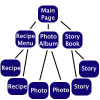
I am grateful to offer this article for repost.  While posted originally at webdesign.org three years ago, it offers the best reason to look deeper into the site structure you;d wish developed in advance of the design. Those in Naperville and Chicago should take notice to these suggestions.  Thinking of them in advance of a web design can save a lot of money and prevent buyers remorse when the site reaches completion.hidden links Ever visited a site and wondered "what am I supposed to do?" Ever got lost in someone else's tangled web?(if not, go to Aurora,Il homepage) Often, people will create a site loaded with information, and present it in such a way that you have to work the site out before you can do anything with it. While it's necessary to organise your information into a logical structure, remember that people find it hard to comprehend anything but the most simple and obvious structures. You may say "Well, it's pretty obvious isn't it", but that's only because you know your site so well. Often, I've wandered aimlessly through sites, not knowing how many levels there are to it or how much information there is "out there somewhere" on the site, and without any idea of what I've missed or whether I "took the right turn". In this example, I've created a hierarchy that organizes a site with recipes, photos and stories. Each of these options is very commonly used on the web, and with any option, the items are all accessible, but what's the best way to organize those items?
1.1
One-Tier Site: All the information is on one page.
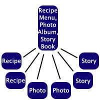
Two-Tier Site:  On the main page, there is a link to each of the six items.
Two-Tier Site: On the main page, there is a link to each of the six items.
Three-Tier Site:  On the main page, there is a link to a page for each category.  These pages may have thumbnails or brief descriptions on them, and have links to the items in that category.
Three-Tier Site: On the main page, there is a link to a page for each category. These pages may have thumbnails or brief descriptions on them, and have links to the items in that category.
The advantage of a one-tier site is that there are no internal links, and there is no navigation. Everything is right there on that page. This is perfect for sites that have very little information on them, but if you have a site that's not minuscule, this would just create a totally disorganized "Wall of Text". The two-tier site allows for a fair bit more information, but if you have a large site, it will confront the visitor with an unsightly "Wall of Links". This site is a three-tier site. I chose that format when I created the site, as it works well. I have a main page, and then you can choose tutorials, articles, resources etc. and then you choose the specific tutorial, article or resource you want. The only problem is that you can't see the third tier from the first page. I sometimes can't remember whether something's a tutorial or an article, and visitors have to choose whether they want a tutorial or a resource without knowing anything about what they will find. When I get around to redesigning this site, I'll to organise it with a Top-Heavy combined three-tier system, explained below. Bottom-Heavy System: 5 This system combines the second and third tiers, with a link to each category on the main page, and multiple items (e.g. stories) on one page. This is perfect for if you have lots of categories, but with not much content in each category. If I tried to set Pegaweb up like this, every tutorial would be on a single "Tutorial Page". It would be about 800k, and about ten miles high. :) Top-Heavy System: 4 As long as this doesn't create mass clutter on your main page, this option has all the advantages of two and three tier systems. The links to each item are on the main page, but are organised into tiers on that page. There will be a fair few links on the main page, but the organisation of the site will be very easy to understand. This is the system I intend to use when I redesign this site. On the main page, there will be tiers, with links to each individual tutorial, article or resource etc. If you look back up the page, you'll find that this system is very similar to the two-tier system - in effect, it IS a two-tier system. The moral of the story is - design your websites to be two-tiered. Choose the bottom-heavy or top-heavy systems as necessary. Unless your site is gigantic, it's possible to keep your site two-tiered, especially by using the bottom-heavy system and creating/removing categories, to balance the clutter between your main page and the rest of the site. This is a reposting of a 2006 article by webdesign.org.  The value of this article is still very much a topic of relevance for web design in the Chicago and Naperville areas.
Read more...

Web Design and Color Importance

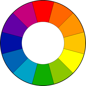
While adjusting for the thoughts for our new design, I have been thinking a lot about what colors will be used.  Every site will inspire a response with not just the design, but the colors used within the framework of that design.   Now that our web design service is fully available tot the Naperville community, we want to have our site brought to it's peak performance(the new unveiling will be 1 month from today). Designing web-sites involves numerous skilled disciplines from type to layout & color. Color is particularly prominent as it provides the first impression to the user. The correct colors can create a good user experience, while incorrect colors can have a bad impact. To create a good website, the website designer needs to know what affect colors can have on people. People subconsciously react to colors & associate them with different emotions and feelings. Colors don't just stir up emotions & feelings that might influence how a site is seen but they can also be cleverly used to direct users to specific sections of your site. color-wheel-300 Every single color that you can think of can be used on the internet these days, which means that picking the right colors can be a mammoth task. Here is a swift summary of how some colors can provoke certain reactions. Green is linked with nature, peace and jealousy. It is also a truly relaxing color and is perfect to use for a relaxing effect. The color white stirs up feelings of purity, simplicity, emptiness and innocence. If used as the main color of a site, it creates a clean and simple feel. Blue is most commonly associated with business sites as it's a strong color that's associated with confidence, coldness, depression, water and peace. The color blue is linked with confidence, loyalty and coolness. It's the best-known color in the world and it's used by many companies to create a feeling of strength & confidence( plus, blue and orange seem to be the Naperville and Chicago favored colors). Black is linked to feelings of mystery and refinement. For more detail go to: www.instant-video-streamer.com. An extremely popular color in design and photo web sites, it can be used effectively to contrast and liven up other colors. Green is linked to organic, nature and relaxation. The paler end of the green spectrum can be used to give a site a relaxed feel. Grey can be associated with respect, humility, decay and boredom. It's used a lot to form shiny gradients in website design to give a professional, ordinary feel to a site. Orange is strongly associated with spirituality and healing. It's the color that symbolizes Buddhism and it has a calming energy about it. It's a bold color that is not as lively as yellow but not as deep as red. Darker shades of purple can be very deep and luscious. It is linked to royalty, spirituality, arrogance and luxury. Lighter shades can represent romance and delicacy. It's a color that's not really used much on sites. Full of energy, vibrancy and stimulation, orange is a fantastic color to use in designing web-sites. It is used to bring youthfulness to a design. Color's role is not just to make a website look good; it can encourage feelings & emotions from the audience.  In the Chicago and Naperville areas, this can be especially important because of how emotionally driven local customers can be. Choosing colors that annoy the end user can have damaging effects on your website, while cleverly selecting can mean that the website meets user expectation.
Read more...

Improve Search Engine Crawl-from DailySEOBlog

Ok, I said earlier today that I barely ever re-post another persons work, , but it's not often that I find two incredibly written and informative articles in the same day. I also haven't had the most time to look around for good info in a few days because of work. Either way, I think that this posting deserves a read as well. The suggestions involved are ones that are valuable to know and sometimes we need to focus on more ourselves.hidden links Links within the posting have been left intact because of their weight and merit. At the end of the post will be a link back to the author. hidden links Enjoy seo-p

10 Tips to ensure better search engine crawling of your site

Even if you have an amazing site, sometimes you have to wait for ages to get some pages indexed and crawled on Google.  Why does this happen ? I’ve found many people complain that after building a great site, and doing the standard chores, waiting so long for the results doesn’t make any sense. Certain things just don’t happen as planned. Like certain pages on a site, doesn’t get indexed and if indexed doesn’t get the right visibility on the search engines. Strange. I can probably attribute all these problems to a couple of SEO factors. Let me try and explain them below.hidden linkshidden linkshidden links

1. Set a sitemap, with the right priorities

Setting a proper sitemap solves most of the problems often. But don’t take this lightly as we have many automated plugins to do the job. Many a times, the automated plugins need good tweaking to ensure that they have the right settings for your site. I have written several posts about sitemaps, like this one, check it out.

2. Publish articles regularly in a predictable fashion

This is not a  way to “control” how often the bots visit you. Google has its own algorithm to find out when it should visit you, but publishing more articles in a regular fashion sure does give Google clues on what your posting frequency is like. Nothing wrong in publishing articles in random, but I’d suggest you keep it pretty much in a predictable fashion so we make the process easy.

3. Link well contextually and often between posts

Cross linking between pages contextually is a great way to make sure that the bots visit all those pages. Contextual links are given more importance probably than any other link on the site, so make use of them.

4. Keep the directory structure simple

If you have a self designed website, make sure you keep the directory structure simple and not too deep. Having more directories to crawl will make the job difficult for the bots. Keep it simple.

5. Block the unnecessary pages with proper SEO techniques

Along with making sure that all the pages are crawled, also make sure that the ones you don’t need to show up in the search results are blocked. (Like the TOS page.) You could use the Meta Noindex and the robots.txt exclusion protocol to get things done.

6. Make the navigation bar simple and accessible

Often I see websites with complex, fancy navigation bar annoying. I mean, it doesn’t have to be fancy to impress your visitors right ? You could use classy CSS styling to get elegant looks and still impress them. The problem with fancy navigation bars are that they often do more harm than good like not allowing proper crawling of the pages linked. There are various techniques you can use to make the navigation bar attractive and still allow smooth crawling, employ them.

7. Practice deep linking

Always practice deep linking (you shouldn’t be having a deep structure in the first place.) if you have a big and deep directory structure. Do not miss out linking to any directory/pages. Use clever linking strategy to link all the directories/categories and pages each other. If possible link to all the main category indexes right from the homepage.

8. Make use of proper anchor texts and internal text links

Linking to pages with images and other elements may also result in poor crawling of those pages. Use proper anchor texts to share the contextual factor among your pages and directories.

9. Keep the URLs simple and easy to remember

Confusing URLs are neither good for Google bots as well as visitors. Google bots love simple, meaningful URLs and visitors love URLs with recall value and those are easy to remember. If you don’t want to screw up things, keep the URLs simple and easy to remember (both for bots and humans). P.S – Google does not have any problems with seemingly confusing or meaningless URLs. They still make out the content from the page, however having meaningful URLs are a definite plus.

10. Use the homepage very well

The homepage as you know is likely to gather the most link juice and importance compared to other pages on the site. (This is just a general observation, but if a page gathers more links to it, it could also get more authority and link juice than the homepage.) Use the homepage well, and add more links to the inner pages from it, so they share the authority. Essentially, factors like how fast to index, how often to index and how deep to index are decided by the search engines. But to a certain level you can control their crawling speed and frequency. The points above are good pointers to this, hope they helped you.hidden links
Read more...

Ten Great Ways to Crush Creativity

Normally, we don't augment other peoples post to place on our site, but today there is an interesting posting on how our best intentions can cause our websites to suffer. hidden links I think this posting could be applied to any form of artistic or business and marketing plan.  We'd like to see what our audience thinks of this article posted on  lifehack.org . I hope you leave feedback on what thoughts you may  have.  A link to the source site will be placed at the bottom of the posting.... Now for the featured post written by Paul Sloane egg Leaders have more power than they realize. They can patiently create a climate of creativity or they can crush it in a series of subtle comments and gestures. Their actions send powerful signals. Their responses to suggestions and ideas are deciphered by staff as encouragement or rejection. If you want to crush creativity in your organization and eliminate all the unnecessary bother of innovation then here are ten steps that are guaranteed to succeed.

1. Criticize

When you hear a new idea criticize it. Show how smart you are by pointing out some of the weaknesses and flaws which will hold it back. The more experienced you are, the easier it is to find fault with other people’s ideas. Decca Records turned down the Beatles, IBM rejected the photocopying idea which launched Xerox, DEC turned down the spreadsheet and various major publishers turned down the first Harry Potter novel. The same thing is happening in most organizations today. New ideas tend to be partly-formed so it is easy to reject them as ‘bad’. They diverge from the narrow focus that we have for the business so we discard them. Furthermore, every time somebody comes to you with an idea which you criticize, it discourages the person from wasting your time with more suggestions. It sends a message that new ideas are not welcome and that anyone who volunteers them is risking criticism or ridicule. This is a sure fire way to crush the creative spirit in your staff.

2. Ban brainstorms

Treat brainstorming as old-fashioned and passé. All that brainstorms do is throw up lots of new ideas that then have to be rejected. If your organization is not holding frequent brainstorm sessions to find creative solutions then you are not wasting time on new ideas. Instead you are sending a message to staff that their input is not required. If people insist on brainstorm meetings then make them long, rambling and unfocused with lots of criticism of radical ideas.

3. Hoard problems

The CEO and senior team should shoulder the responsibility for solving all the company’s major problems. Strategic issues are too complicated and high-level for the ordinary staff. After all, if people at the grass-roots knew the strategic challenges the organization faces then they would feel insecure and threatened. Don’t involve staff in serious issues, don’t tell them the big picture and above all don’t challenge them to come up with solutions.

4. Focus on efficiency not innovation

Focus solely on making the current business model work better. If we concentrate on making the current system work better then we will not waste time on looking for different systems. The current business model is the one that you helped develop and it is obviously the best one for the business. After all, if the makers of horse drawn carriages had improved quality they could have stopped automobiles taking their markets. The same principle applied with makers of slide rules, LP records, typewriters and gas lights.

5. Overwork

Establish a culture of long hours and hard work. Encourage the belief that hard work alone will solve the problem. We do not need to find a different way of solving a problem – rather we must just work harder at the old way of doing things. Make sure that the working day has no time for learning, fun, lateral thinking, wild ideas or testing of new initiatives.

6. Adhere to the plan

Plan in great detail and then do not deviate from the plan regardless of circumstances. ‘We cannot try that idea because it is not in the plan and we have no budget for it.’ Keep to the vision that was in the plan and ignore fads like market changes and customer fashions – they will pass.

7. Punish mistakes

If someone tries an entrepreneurial idea that fails then blame and retribution must follow. Reward success and punish failure. That way we will reinforce the existing way of doing things and discourage dangerous experiments.

8. Don’t look outside

We understand our business better than outsiders. After all we have been working in it for years. Other industries are fundamentally different and just because something works there does not mean it will work here. Consultants are generally over-priced and tell you things you could have figured out anyway. We need to find the solutions inside the business by working harder.

9. Promote people like you from within

Promoting from within is a good sign. It helps retain people and they can see a reward for loyalty and hard work. It means we don’t get polluted with heretical ideas from outside. Also if the CEO promotes people like him then he can achieve consistency and succession. It is best to find managers who agree with the CEO and praise him for his acumen and foresight.

10. Don’t waste money on training

Talent cannot be taught. It is it a rare thing possessed by a handful of gifted individuals. So why waste money trying to turn ducks into swans? Hire our kind of people and let them learn our system. Work them hard, keep them focused on our business model and do not allow them to fool around with crazy experiments. Workshops, budgets and time allocated to creativity and innovation are all wasteful extravagances. We know what we need to succeed so let’s just get on with it. Ten Great Ways to Crush Creativity
Read more...